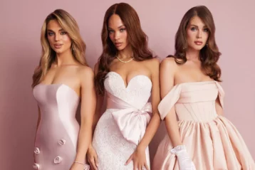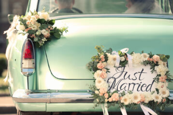


Two Industry Leaders to Define the Year’s Wedding Trends
CHEVY CHASE, Md., Jan. 30, 2019 /PRNewswire/ — WeddingWire, Inc. today announced its exclusive collaboration with with the Pantone Color Institute and unveiled the 2019 Wedding Color Palettes by WeddingWire x Pantone Color Institute. A global leader in the wedding industry, WeddingWire is linking arms with an iconic name in color to deliver aspirational yet attainable inspiration for all couples who plan to wed in 2019.
In fact, color is one of the first details couples think about when establishing their wedding style and theme, with nearly half of couples noting they select wedding color schemes “soon after getting engaged.” With 40 percent of engagements taking place between November and February, according to the WeddingWire 2018 Newlywed Report, these palettes, created by the Pantone Color Institute, will help set the stage for nuptials of newly engaged couples throughout the year.
“Couples are now planning their weddings earlier than ever before, with two-thirds of millennials taking at least one wedding planning action before they even get engaged,” said Jeffra Trumpower, Creative Director, WeddingWire. “With color choices oftentimes informing the majority of a couple’s wedding planning journey, we’re thrilled to partner with one of the most prestigious brands in color to offer a variety of palettes for weddings of all styles in 2019.”
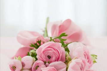
Love in Bloom
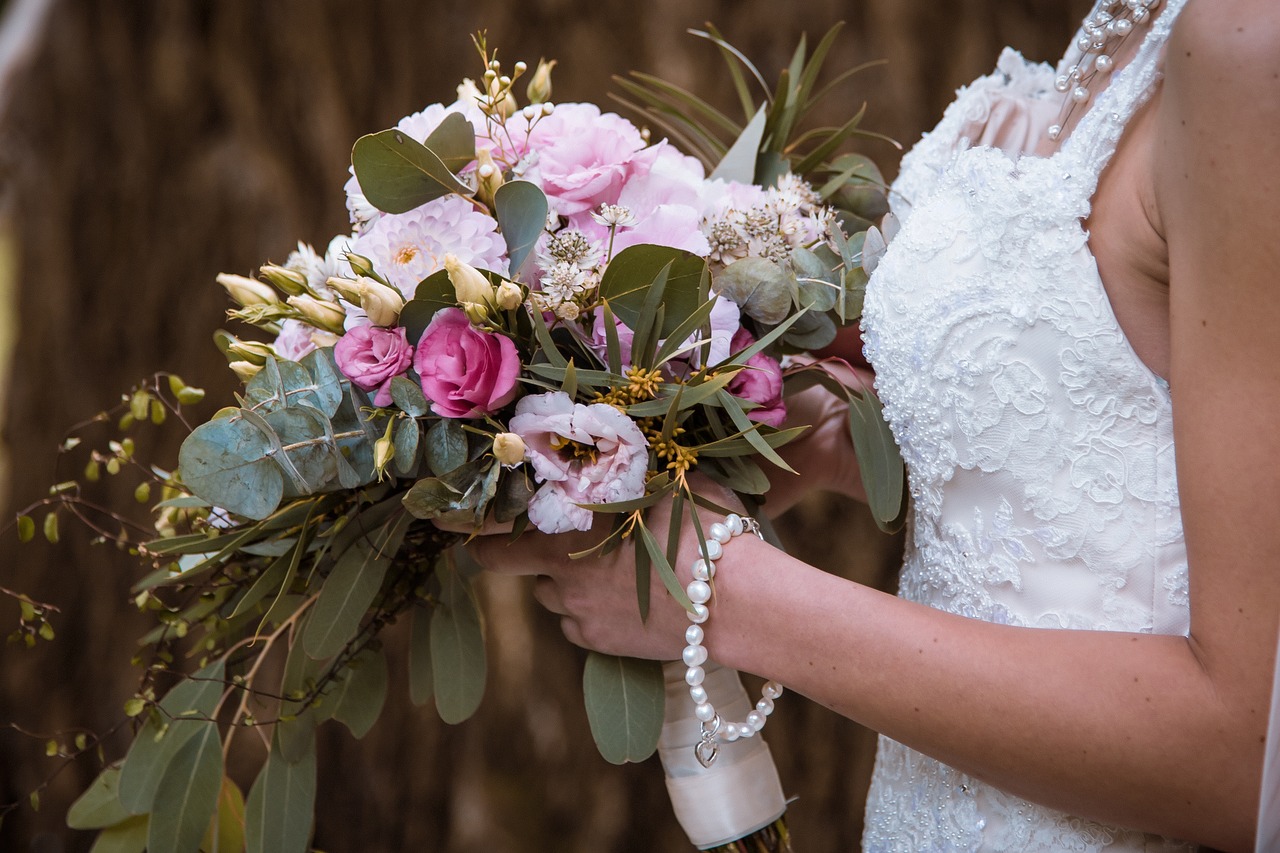
‘Love in Bloom,’ is comprised of a group of soft and nurturing shades contrasted with a bold fuchsia red, an earthy green and a shimmering silver metallic. Structural floral installations are making a big impact in 2019 wedding decor, with an opportunity for couples to incorporate greenery and bright pops of color alongside abstract sculptures in wood or metallic tones. Additionally, styled grazing tables can incorporate red pops of dried cherries and other fruits to blend seamlessly within the palette. ‘Love in Bloom’ leans to the warm side of the spectrum with its visual portrayal of comfort and enjoyment, affection and contentment. Blending nostalgia with new, Love in Bloom takes an innovative approach to romantic love.
Golden Hour
A palette of easy and uncomplicated honest colors, ‘Golden Hour’ celebrates the physical beauty of nature. The palette has a modern, fresh twist on typically traditional colors, and the addition of a pale gold and copper metallic act as a highlight, enhancing and further increasing the palette’s organic and unconventional appeal. Warm neutrals in this palette offer the opportunity to incorporate one of 2019’s most popular texture trends: pampas grass, a natural colored wheatgrass that pairs well with minimalist florals.
Paradise Found
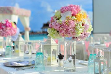
Inspired by the tropics, this palette shines with illuminating oranges, vibrant teals, radiant blues and a refreshing splash of turquoise reminiscent of water and sky. ‘Paradise Found’ represents a refreshing escape to an idyllic destination, no matter where the couple’s wedding is located. The playfulness of the palette invites couples to mix and match wedding party attire — including groomsmen suiting and accessories in fun colors across the spectrum. Signature cocktails can also serve as artwork and decor, tapping into the teals and oranges with tropical juices and floral garnishes. A pristine shade of white emulates whitecaps of waves, whether a couple strives for a sunlit and warm or a watery and cool theme.
Stroke of Midnight
‘Stroke of Midnight’ offers ‘after dark’ shades of twilight blues and exotic red infused purples. Twinkling whites along with clean and cool metallics add sheen and sparkle, providing an incandescent glow to this cutting-edge collection of colors. This palette is perfect for incorporating 2019’s linen of choice: velvet. ‘Stroke of Midnight’ celebrates the powerful energy and magic surrounding the beginnings of a new chapter for couples.
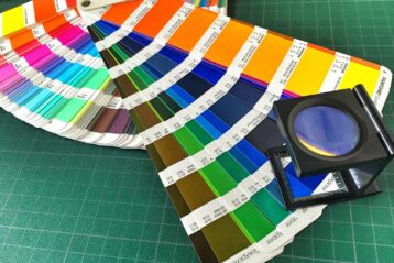
“Color is a powerful tool – not just for enhancing aesthetics that are critical to every element of a wedding – but to evoke emotion and create the special mood that a couple wishes to communicate throughout their special day from playful and adventurous to romantic and timeless, and everything in between,” said Laurie Pressman, Vice President of the Pantone Color Institute. “In concert with the resources and planning tools from WeddingWire, these custom palettes created by The Pantone Color Institute are intended to help couples navigate their color and design choices in an inspiring, meaningful and uniquely memorable way.”
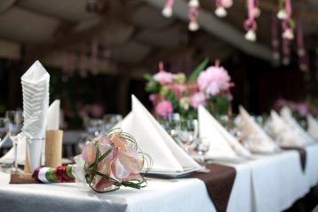
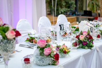
A new WeddingWire color report found wedding color schemes are heavily influenced by couples’ favorite colors and colors considered flattering for wedding party attire, with the most popular primary hues for the “I do’s” being blue, purple, red and pink, and secondary, accent colors being gold and white. The most popular areas for couples to feature wedding colors include florals, wedding party attire and table settings, however they can also be highlighted in bar elements like signature cocktail ingredients, napkins and cocktails stirrers, and even lighting for the reception.
For more information about WeddingWire’s partnership with the Pantone Color Institute, the 2019 wedding color palettes, and ways couples can ground their wedding planning in color, visit: weddingwire.com/pantone
About WeddingWire
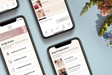
WeddingWire, Inc. is a trusted global online marketplace, connecting consumers with local wedding professionals and a suite of comprehensive tools that make wedding planning easier. Operating within a $250 billion industry, WeddingWire helps 16 million users every month find the right team of wedding professionals to personalize and pull off their special day. Consumers around the world are able to read more than 5 million vendor reviews and search, compare and book from a directory of over 500,000 vendors local to them. Founded in 2007, the WeddingWire portfolio serves couples and wedding professionals across 15 countries in North America, Latin America, Europe and Asia. The company has more than 950 employees and is headquartered in Washington, DC with international headquarters in Barcelona, Spain. Visit WeddingWire online at WeddingWire.com and follow on social media at Facebook.com/WeddingWire and @WeddingWire on Instagram, Twitter and Pinterest.
About The Pantone Color Institute
The Pantone Color Institute is the business unit within Pantone that highlights the top seasonal runway colors, selects the Pantone Color of the Year, forecasts global color trends, and advises companies on color for product and brand visual identity. Through seasonal trend forecasts, color psychology, and color consulting, the Pantone Color Institute partners with global brands to effectively leverage the power, psychology, and emotion of color in their design strategy.
SOURCE WeddingWire, Inc.